
User Clustering with K-means model, bike ride case part 3
- jercoli

- Feb 25, 2021
- 5 min read
Updated: Mar 27, 2021
We continue to investigate the data of the cyclists that we started in the first post of the series. This time we will enter the world of machine learning with this first mathematical model : K-means clustering
K-Means is an unsupervised clustering algorithm. It is used when we have unlabeled data and its objective is to find “K” clusters between the data.
Applying this model we will try to group the users of the public bicycle system into clusters.
ok let's start importing libraries and opening our data file
import matplotlib.pyplot as plt
import seaborn as sns
import pandas as pd
import numpy as np
%matplotlib notebook

# open our data from google drive
from google.colab import drive
drive.mount('/gdrive')
%cd /gdrive/MyDrive
bike_ride_2018 = pd.read_csv('./BA-bikes-rides-2018.csv')
# put -1 in NaN values
bike_ride_2018 = bike_ride_2018.fillna(-1)
# rename columns and convert id to int
bike_ride_2018.rename(columns={'fecha_origen_recorrido':'dateTime'}, inplace=True)
bike_ride_2018['id_estacion_origen'] = bike_ride_2018['id_estacion_origen'].astype(int)
bike_ride_2018['id_estacion_destino'] = bike_ride_2018['id_estacion_destino'].astype(int)
# describe columns
bike_ride_2018.columns
Index(['id_usuario', 'genero_usuario', 'dateTime', 'id_estacion_origen', 'nombre_estacion_origen', 'long_estacion_origen', 'lat_estacion_origen', 'domicilio_estacion_origen', 'duracion_recorrido', 'fecha_destino_recorrido', 'id_estacion_destino', 'nombre_estacion_destino', 'long_estacion_destino', 'lat_estacion_destino', 'domicilio_estacion_destino'], dtype='object')
To classify our bicycle users, we will do so through the use of the time (what days of the week and hours) they have given the service. For this purpose we will obtain 3 new data per user:
trips made on weekends (Saturday/Sunday)
trips made on business days in peak hours (Ex.peak hours: 7-9:30 and 17-20:30)
trips made on business days in non-peak hours
# Get day type - Laboral peak hour or not, weekend (Sat/Sun)
''' param x = datetime type
return dayType = string ['LPH','LNPH','WEND')
 '''
from datetime import time
def get_day_type(x):
  dayWeek = x.dayofweek
 # if laboral day
 if (dayWeek < 5):
 # check if peak hour (Ex: 7 to 9:30 and 17 to 20:30)
    t_7 = time(hour=7, minute=0)
    t_930 = time(hour=9, minute=30)
    t_17 = time(hour=17, minute=0)
    t_2030 = time(hour=20, minute=30)
 if ( t_7 <= x.time() <= t_930) or ( t_17 <= x.time() <= t_2030):
  return 'LPH'
 else:
  return 'LNPH'
 return 'WEND'

# call get_day_type function and save in 'day_type' new column
bike_ride_2018['day_type'] = pd.to_datetime(bike_ride_2018['dateTime']).apply(get_day_type)
bike_ride_2018['day_type']
Now we calculate the trips of each user by type of day (creating different dataframes):
# calculate total trips for user in weekends
count_trips_user = bike_ride_2018[bike_ride_2018['day_type']=='WEND'].groupby(['id_usuario']).size()
trips_wend = count_trips_user.to_frame(name = 'weekend_trips').reset_index()
trips_wend.describe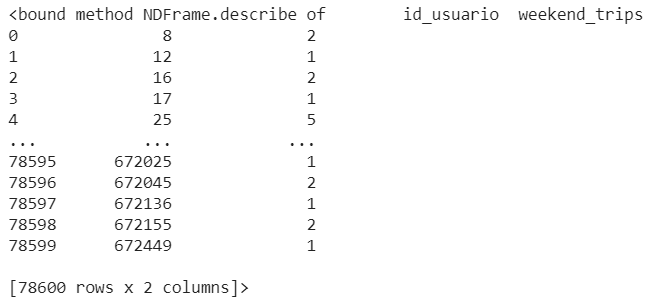
same procedure for workdays in peak/rush hour or not
# calculate total trips for user in laboral days Peak hours
count_trips_user = bike_ride_2018[bike_ride_2018['day_type']=='LPH'].groupby(['id_usuario']).size()
trips_lph = count_trips_user.to_frame(name = 'lab_PH_trips').reset_index()

# calculate total trips for user in laboral days Non Peak hours
count_trips_user = bike_ride_2018[bike_ride_2018['day_type']=='LNPH'].groupby(['id_usuario']).size()
trips_lnph = count_trips_user.to_frame(name = 'lab_NPH_trips').reset_index()
we also need to create a dataframe that contains our users uniquely
# get all users in a df
users = bike_ride_2018['id_usuario'].drop_duplicates().reset_index()
users.drop(['index'], axis = 1, inplace=True)
now merge the trips dataframes with user dataframe
# merge the 3 dataframes and fill with 0 in NaN values
df = pd.merge(users, trips_wend, how='outer', on='id_usuario')
df = pd.merge(df, trips_lph, how='outer', on='id_usuario')
df = pd.merge(df, trips_lnph, how='outer', on='id_usuario')
df = df.fillna(0)
df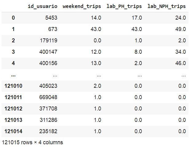
Now, we visualize our new data to understand how the number of users is distributed by type of trip. We will create a figure with 3 subplots (1 for each type of trip) in the same row.
fig = plt.gcf()
fig.set_size_inches( 20, 8)

plt.subplot(1, 3, 1)
plt.xlim(1, 100)
plt.ylim(0, 20000)
sns.histplot(data=df, x="weekend_trips", bins=60, kde=True, color='red')
ax = plt.gca()
ax.set_title("Weekend Bike rides - Buenos Aires, 2018")

plt.subplot(1, 3, 2)
plt.xlim(10, 150)
plt.ylim(0, 20000)
sns.histplot(data=df, x="lab_PH_trips", bins=60, kde=True, color='blue')
ax = plt.gca()
ax.set_title("Peak hour Laboral Bike rides - Buenos Aires, 2018")

plt.subplot(1, 3, 3)
plt.xlim(10, 200)
plt.ylim(0, 20000)
sns.histplot(data=df, x="lab_NPH_trips", bins=60, kde=True, color='green')
ax = plt.gca()
ax.set_title("Non Peak hour Laboral Bike rides - Buenos Aires, 2018")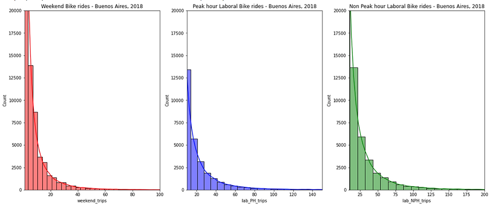
We have limited the values on the y-axis up to 20000 so as not to distort the graphics, because there are a large number of users who have very few trips in each type.
K-means model brief explanation
The algorithm works iteratively to assign each “point” (the rows of our input set, form a coordinate) one of the “K” groups based on its characteristics. They are grouped based on the similarity of their features.
In the image below, the groups are defined and their position is adjusted in each iteration of the process, until the algorithm converges. Also we see the centroid points, which as their position changes, they modify the groups. We define the centroid as the "central coordinate" of each of the K sets that will be used to label new samples.

https://en.wikipedia.org/wiki/File:K-means_convergence.gif
How would you imagine a key parameter for this model is the K value (number of clusters), which we will try to obtain by executing the algorithm for a range of K values, see the results and compare characteristics of the groups obtained
ok let's start with the code. To create an instance of the K-means model we will use the scikit learn library, we will leave all the parameters by default except the number of clusters (default n_clusters = 8) that we will adjust from 2 to 15
from sklearn.cluster import KMeans
# Find optimal number of clusters
def make_list_of_K(K, dataframe):
 '''inputs: K as integer , dataframe
    make a list of inertia values against 2 to K (inclusive)
    return the inertia values list
    '''
    cluster_values = list(range(2, K+1))
    inertia_values=[]

    for c in cluster_values:
        model = KMeans(n_clusters = c)
        model.fit(dataframe)
        inertia_values.append(model.inertia_)

    return inertia_values

# save inertia values for k values between 2 to 15
# with df.iloc[:, 1:] we pass only the trips values columns
results = make_list_of_K(15, df.iloc[:, 1:])

k_values_distances = pd.DataFrame({"clusters": list(range(2, 16)),
 "cluster_sum_squared_distances": results})
Inertia is the sum of squared error for each cluster (cluster_sum_squared_distances column). Therefore the smaller the inertia the denser the cluster (closer together all the points are).
In the image below you see the list of inertia values for each value of K clusters
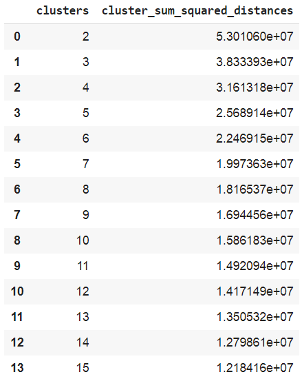
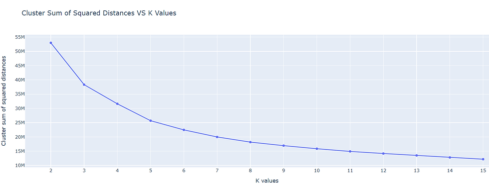
We can see that the curve stabilizes from 6 clusters, so we will use that value for our k-means model, then we execute fit_predict so that each row of our dataframe has its cluster number
# bike users k means clustering
users_kmeans_model = KMeans(n_clusters = 6)
users_kmeans_model.fit_predict(df.iloc[:,1:])
# create new columns with label (cluster number and str cluster_name)
df["clusters"] = users_kmeans_model.labels_
df["cluster_name"] = df["clusters"].astype(str)
Now we have our users classified in their own cluster, so if we want to know how many users are in cluster 4:
df[df['clusters'] == 4]
Finally we will visualize how our users have been grouped in an interactive 3d graphic
# visualize bike users clusters with a 3D plot
import plotly.express as px
fig = px.scatter_3d(df,
                    x="weekend_trips",
                    y="lab_PH_trips",
                    z="lab_NPH_trips",
                    color="cluster_name",
                    category_orders = {"cluster_name":
                                       ["0", "1", "2", "3", "4", "5"]},
                    )
fig.update_layout(margin=dict(l=0, r=0, b=0, t=0))
fig.show()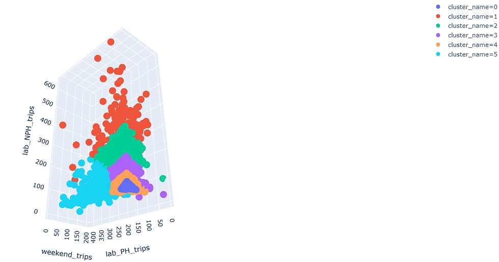
In the graph we can analyze if the groups really have any meaning with the features that we have built, otherwise we must add more significant features to our model.
To download the jupyter nb: github k-means example Ok folks, now is time to generate your own K-means model project with Scikit-Learn and advance your data science career !.
Your comments are appreciated

Comments