The heart of logistic regression
- jercoli

- Apr 11, 2021
- 7 min read
In this post we will develop a binary classification model with a dataset related to the health issue. It was obtained from kaggle.com and is related to the possibility of having a heart attack based on 14 features obtained.
We will start by exploring our dataset that is already clean (without null values), to then generate a logistic regression model and evaluate its performance.
Logistic regression
Is a type of regression analysis used to predict the outcome of a categorical variable (a variable that can take on a limited number of categories, typically two) based on the independent or predictor variables. It is useful for modeling the probability of an event occurring as a function of other factors.

Logitic sigmoid function
The procedure is quite similar to multiple linear regression, with the exception that the response variable is binomial. The result is the impact of each variable on the odds ratio of the observed event of interest.
So, logistic (or logit ) regression is used when the dependent variable is binary in nature. For example predict if spam or not, sick with covid or not, positive comment of a review or not, etc.
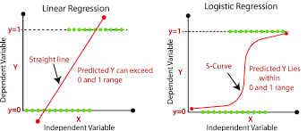
Linear vs Logistic regression
Import libraries an explore dataset
import matplotlib.pyplot as plt
import pandas as pd
import numpy as np
import seaborn as sns
from sklearn import preprocessing
from sklearn.linear_model import LogisticRegression
from sklearn.model_selection import train_test_split
from sklearn import metrics
# create dataframe from csv file
heart_data = pd.read_csv('./data-science/heart.csv')
heart_data.head()
heart_data.info()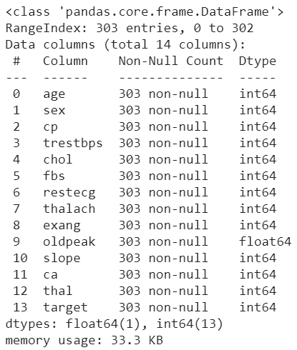
Attribute Information:
0) age - 1) sex - 2) chest pain type (4 values)
3) resting blood pressure - 4) serum cholestoral in mg/dl
5)fasting blood sugar > 120 mg/dl - 6) resting electrocard. results (values 0,1,2)
7) max.heart rate achieved - 8) exercise induced angina
9) oldpeak - 10)the slope of the peak exercise
11) number of major vessels (0-3)
12) thal: 0 = normal; 1 = fixed defect; 2 = reversable defect
13) target: 0= less chance of heart attack 1= more chance of heart attack
Let's start doing some explorations on the data we have.
In the graph below, we have a heatmap correlation map between the variables, including our target. Values close to 0 indicate that there is no correlation, negative values show correlation with a negative trend (greater the closer to -1) and positive, vice versa.
# Correlation ranges from -1 to +1.
# Values closer to zero means there is no linear trend between the 2 variables.
# Close to 1, more positive correlation, # –1 indicates a perfect negative corr.

corr = heart_data.corr()
plt.figure(figsize=(16,9))
ax = sns.heatmap(
    corr,
    annot = True,
    vmin=-1, vmax=1, center=0,
    cmap=sns.diverging_palette(10, 240, n=50),
    square=True
)
ax.set_xticklabels(
    ax.get_xticklabels(),
    rotation=45,
    horizontalalignment='right'
)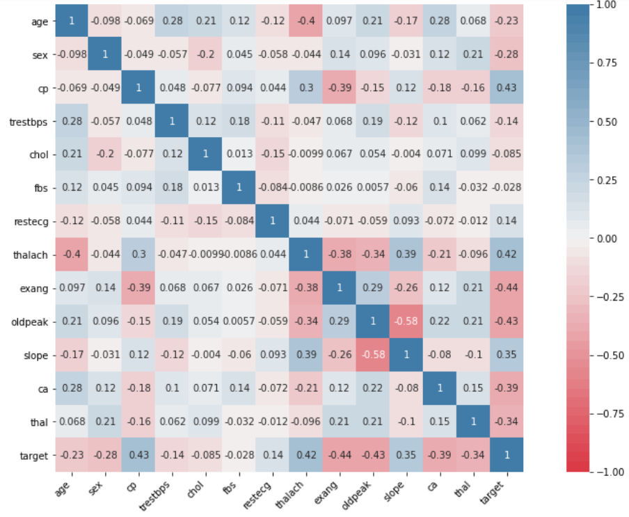
In the correlation map, we see that the features fbs and chol have a correlation with target close to 0 (without correlation), so we will not consider them important in our model and we will proceed to delete. We will actually create a new dataframe (heart_part) to keep the original in case we need to reuse it at some point
# Drop 2 features with poor correlation with target
heart_part=heart_data.drop(columns=['fbs', 'chol'])
If we wanted to better visualize the correlation of -0.4 (negative trend ) between age and max heart rate (thalach) by cp (chest pain type):
# Chest pain type (cp) group
# Age VS maximum heart rate (thalach) = -0.4 trend
g = sns.FacetGrid(heart_data, col="cp")
g.map(sns.scatterplot, "age", "thalach", alpha=.7)
g.add_legend()

We can also visualize with seaborn, the relationship between 2 variables with the separation of points through a sigmoid line.
For this we will use the lmplot method with
the logistic = True parameter.
In the example on the right we see the target (0-1) against feature thalach.
Build our logistic regression model
We will first create our training and test datasets, and then verify that we do not have a class imbalance problem in our training data
# X features and Y labels
X=heart_part.drop(columns=['target'])
Y=heart_part['target']
# Build train and test datasets
X_train,X_test,y_train,y_test=train_test_split(X,Y,random_state=0)
Class imbalance problem
It is a problem that arises in the classification models, because the distribution of the samples in the classes is unbalanced, or skewed. This occurs when one or more classes have very low sample proportions in the training data compared to the other class/es.
why should we solve it?
let's talk about "accuracy paradox", is the paradoxical finding that accuracy is not a good metric for predictive models when classifying in predictive analytics. For example, if we had a good metric of 90% accuracy on unbalanced data (with 90% samples from class 1 and only 10% from class 2), our model would look at the data and decide that the best it can do is predict that the data is class 1 !!, in this case measuring only the accuracy leads us to a misleading position in the classification
how to solve it?
class imbalance is not resolved, it remains as an open problem, and once identified, some way to alleviate it must be addressed, which will be considered in a future post on the subject.
So, we check that the class samples are not excessively unbalanced.
from collections import Counter
Counter(y_train)
Counter({0: 105, 1: 122})
The training data in both classes are quite close so we should not worry in this case about the class imbalance problem.
Now we must normalize our X data so that they are in the same range of values and facilitate the calculations of the model
# Scale the X data
from sklearn.preprocessing import StandardScaler
scaler = StandardScaler()
X_train = scaler.fit_transform(X_train)
X_test = scaler.transform(X_test)
Now we create our logistic regression model
# build logistic regression model, train and predict test data
lr = LogisticRegression()
model = lr.fit(X_train, y_train)
lr_predict = lr.predict(X_test)
Let's measure the model's performance
# import data modeling metrics
from sklearn.metrics import confusion_matrix, accuracy_score, classification_report
lr_conf_matrix = confusion_matrix(y_test, lr_predict)
lr_acc_score = accuracy_score(y_test, lr_predict)
print("confusion matrix")
print(lr_conf_matrix)
print("\n")
print("Accuracy of Logistic Regression:",lr_acc_score*100,'\n')
print(classification_report(y_test,lr_predict))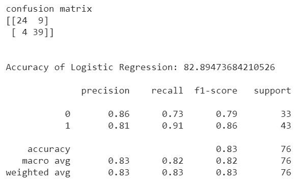
For a better visualization of our confusion matrix we will use Seaborn
df_cm = pd.DataFrame(lr_conf_matrix, columns=np.unique(y_test), index = np.unique(y_test))
df_cm.index.name = 'Real'
df_cm.columns.name = 'Predicted'
plt.figure(figsize = (10,7))
sns.set(font_scale=1.2)
sns.heatmap(df_cm, cmap="Blues", annot=True,annot_kws={"size": 14})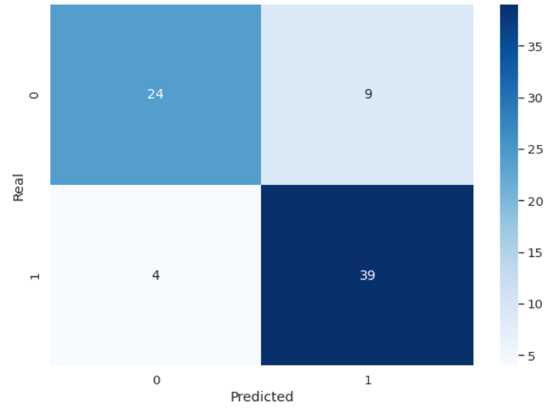
Ok, but what do all those metrics mean? If you have read the previous post on linear regression, should you recognize the value of accuracy, which in this case is 82.89%, and the others?
Metrics for binary classification
a) Confusion matrix
It is a table with 4 different combinations of predicted and actual values.
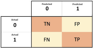
TN (true negat.): Predicted negative and it’s true
FP (false posit./type 1 error): Predicted positive and it’s false
FN (false negat./type 2 error): Predicted negative and it’s false
TP (true posit.) : Predicted positive and it’s true
In our case, we have, for example, 39 TP and 4 FN. This indicates that our model predicted 39 samples of the actual 43 as feasible for heart attacks, leaving 4 samples unidentified as positive (type 2 error). In this case where we are predicting serious health problems in patients, we should minimize this last value (FN).
While the model has identified 24 of the 33 samples as negative, which leaves us 9 samples not correctly identified as negative. Although the error rate is higher, it is not as serious as in the previous case (FN), having identified 9 samples of patients with the possibility of a heart attack when it was not (FP).
b) Precision = TP / (TP+FP)
Important if we have to avoid false positives, in our case we look at the value over class 1 (more chance of heart attack) => 39 / (39+9) = 0,8125
c) Recall (also called True Positive Rate or Sensitivity ) = TP / (TP+FN)
Important if we have to avoid false negatives (that's our health case) => 39 / (39+4) = 0,9069
d) F1-score = 2.TP / (2. TP)+FN+FP)
Combines precision and recall in a single value => 2.39 / (2.39)+4+9 = 0,8571
It is important to get in mind that there is a tradeoff between precision and recall (we increase precision, lower recall and vice versa)
in short there are:
more recall-oriented tasks (high consequence if we do not detect a positive)
disease detection, search and extraction of legal information
more precision-oriented tasks (high consequence if we don't detect a negative)
search engine ranking, document classifier
e) False Positive Rate (also called False Alarm Rate, fall-outs) = FP / (FP+TN)
Summarizes how often a positive class is predicted when the actual outcome is negative.
f) ROC curves
A Receiver Operating Characteristic (ROC curve) summarize the trade-off between the True Positive Rate/Recall (b) and False Positive Rate (e) for a predictive model using different probability thresholds. Its use is appropiate when the observations are balanced between each class
ROC/AUC curve
Ok, enough metrics to ponder on, let's go back to evaluating our logistic model. We had said that our 2 classes are quite balanced so it is advisable to see the performance of the model taking the ROC curve values. Hey stop here !, why is it important to visualize this ROC curve?
The curves of different models can be compared directly in general or for different thresholds.
The area under the curve (AUC ) can be used as a summary of the model skill.
Remember that when we predict a binary result, it is a correct prediction (true positive) or not (false positive). That same tension is generated with true negatives and false negatives. So, what is a skillful model? A skillful model will assign a higher probability to a randomly chosen real positive occurrence than to an average negative occurrence. Skillful patterns are generally represented by curves that slope toward the top left of the plot.
We are going to generate a roc-auc curve plot on our data, for that we must first obtain a list with the probability predictions made by our classifier model on each of the samples (rows)
# obtain prediction for each row of X_test
predictions = model.predict_proba(X_test)
# build roc_curve values with y_test and probability
# predictions of 1 value class (more chance heart attack)
fpr, recall, thresholds = roc_curve(y_test, predictions[:, 1])
# compute Area Under the Roc Curve
roc_auc = auc(fpr, recall)
# Plot Roc-Auc
plt.figure(figsize = (10,7))
plt.title('Receiver Operating Characteristic')
plt.plot(fpr,recall,'b',label='AUC = %0.2f' % roc_auc)
plt.legend(loc='lower right')
plt.plot([0,1], [0,1], 'r--')
plt.xlim([0.0, 1.0])
plt.ylim([0.0, 1.0])
plt.xlabel('Fall-out')
plt.ylabel('Recall')
plt.show()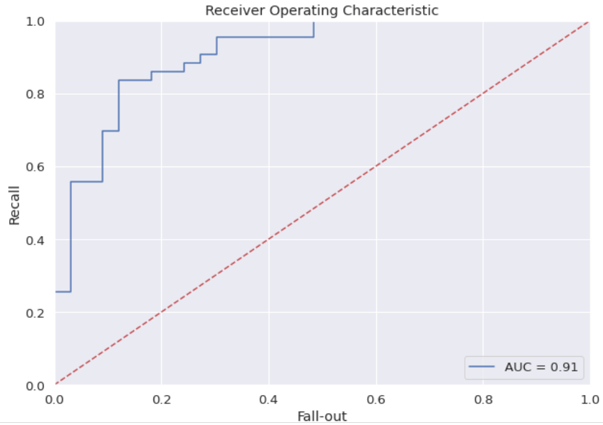
The red dotted line would be a model without skill, one that cannot discriminate between classes and is represented at the point (0.5, 0.5), at each threshold it is represented by a diagonal line from the bottom left of the graph to the top right and has an AUC of 0.5.
A model with perfect ability is represented at one point (0,1). Our ROC curve is represented by the blue line, and outperforms the random 0.5 AUC (red dotted line).
As always the github link with the complete logistic regression jupyter notebook is attached so that you can verify the code for yourself.
Ok folks, now is time to generate your own binary classification with Logistic Regression model project with Scikit-Learn and advance your data science career, see you soon.
Your comments are appreciated


Comments